
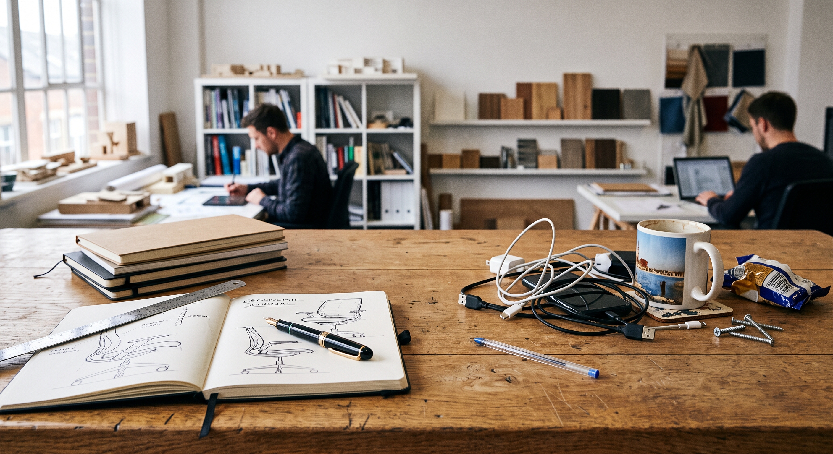
Every learning space we work in arrived with a story. The Victorian board school with ceilings built for another century. The 1970s open-plan block, born from a genuine belief that learning shouldn't be boxed in. The glass atrium from a rebuild programme, the converted office block, the college campus where the café doubles as library overflow, the lecture theatre built for three hundred when the course now has forty. Very few of these spaces were accidents. Plenty were designed with real pedagogical conviction.
But intention has a half-life. Budgets get value-engineered, buildings outlive the ideas that shaped them, and the people who held the vision move on while the walls stay put. What we're left with is learning by default. Spaces that keep teaching long after anyone has asked what they're teaching.
The Room Is Always Teaching
Space is never neutral. The University of Salford's Clever Classrooms study tracked 3,766 pupils across 153 classrooms and found that the physical characteristics of the classroom explained 16% of the variation in their learning progress over a year. Light, air, temperature, sound, layout.
That research was in primary schools, and so is most of what we know about learning environments. That should bother us. A sixteen-year-old in a construction workshop, an apprentice in a college training room and a mature student in a university study hub are all being shaped by space too. We've simply studied them less, which tells its own story about who we design for.
Open and Closed Both Have Champions
Open spaces can be glorious. Collaboration, movement, team teaching, a sense that learning isn't locked away. Enclosed rooms offer focus, privacy and belonging. Both have passionate advocates, and both are right some of the time.
The trouble starts when one philosophy gets built for everyone. A 2023 University of Melbourne study fitted open-plan classrooms with a sound-treated dividing wall and alternated it term by term. Same children, same teachers. Nearly two thirds made faster reading progress with the wall up, and those who lost most ground in the open space had weaker attention and listening skills. Every one of them was considered typically developing. A handful actually did better in the open space. No single room suited everyone.
The same tension plays out in a college's open-plan learning centre and in every university library refit that pits silent study against social learning. The question was never open or closed. It's who each space serves, and what happens to everyone else.
Beautiful Work Deserves a Wall
Anyone who has spent time in EL Education schools like XP knows the power of beautiful work. When young people know their work will be exhibited, critiqued and seen by people who matter, the drafts get better, the pride is real and the standard rises. A grade in a markbook can't replicate that. Displays that honour work are part of the learning, not decoration on top of it.
But there's a difference between an exhibition and wallpaper. A Carnegie Mellon experiment found young children in a heavily decorated room spent 38.6% of lesson time off task, compared with 28.4% in a sparse one, and learned less. It was a small study, so we hold it lightly. The lesson isn't fewer displays. It's displays chosen with purpose, curated, refreshed and given room to breathe.
Neither Chaos Nor Beige
Clever Classrooms found that the link between stimulation and learning isn't a straight line. Too chaotic hurt progress. So did too boring. The sweet spot sat somewhere in the middle.
That matters enormously for neurodivergent learners, and for Ben it's lived experience rather than theory. Too much stimulation overwhelms. Strip everything away, though, and under-stimulation brings its own fog and restlessness. The answer is neither the circus nor the cell.
Which means calm needs designing too. Simple isn't the absence of decisions. A genuinely calm space has planned lighting, considered acoustics, clear sightlines, purposeful materials and a reason to be there. It isn't beanbags and incense in a cupboard nobody else wanted.
Choice Needs Guardrails
Choice of space is powerful, but choice without structure isn't agency. It's drift. Letting learners wander between zones whenever they fancy can leave the most vulnerable moving the most and learning the least. The best flexible environments, whether a primary learning base, a sixth form study centre or a university learning commons, give each space a clear purpose, build shared routines for moving between them, and have adults who help learners work out where they do their best thinking. Agency with guardrails, built into the floor plan.
Inclusion Is Bigger Than a Register
Too often, inclusive design gets filed under SEND. A sensory room here, a quiet corner there, approved once a need has been evidenced. That work matters enormously. But it's a narrow door.
Think about who else is in the room. The child with glue ear this term. The learner still mastering English, for whom a noisy space turns every instruction into a puzzle. The apprentice straight off a night shift. The mature student who's been up since five with the kids. The undergraduate carrying grief into a 300-seat lecture theatre. The lecturer whose voice is shot by Thursday. None of them sit on a register. All of them are shaped by the space.
Need moves by the day, the hour, the session. A building that only flexes after a diagnosis excludes by default.
From Default to Design
None of this demands a new building. It demands that we look again at the ones we have, name the intentions behind them, and ask honestly whether those intentions still serve the people in front of us.
1. Name the intention. Every space carries an idea about learning. Make it explicit, then check whether it still holds for the people using it today.
2. Design for choice, with guardrails. Open and enclosed, buzz and calm, side by side, with clear purposes and routines so choice becomes agency rather than drift.
3. Exhibit, don't wallpaper. Celebrate beautiful work with purpose and pride, curate ruthlessly, and leave room to breathe.
4. Plan the calm as carefully as the buzz. Aim for the middle of the stimulation curve. Simple needs as much intention as vibrant, and it's never just beanbags.
5. Widen the inclusion lens. From reception to postgraduate, design for fluctuating need, not just identified need, and ask learners and staff how the space really feels.
Our buildings carry the fingerprints of an industrial model that prized supervision, efficiency and cost per square metre, layered with decades of good ideas that never quite got finished. That model isn't broken. It's irrelevant to what we now know about how people of every age think, feel and learn. Every refurbishment, every timetable rethink, every September rearrange is a chance to move from default to design. We don't need a bigger budget to start. We need to see our spaces through the eyes of every learner who walks into them, from the reception class to the lecture theatre, and design like it matters. Because it does.
By Design, Not By Default
Every learning space we work in arrived with a story. The Victorian board school with ceilings built for another century. The 1970s open-plan block, born from a genuine belief that learning shouldn't be boxed in. The glass atrium from a rebuild programme, the converted office block, the college campus where the café doubles as library overflow, the lecture theatre built for three hundred when the course now has forty. Very few of these spaces were accidents. Plenty were designed with real pedagogical conviction.
But intention has a half-life. Budgets get value-engineered, buildings outlive the ideas that shaped them, and the people who held the vision move on while the walls stay put. What we're left with is learning by default. Spaces that keep teaching long after anyone has asked what they're teaching.
The Room Is Always Teaching
Space is never neutral. The University of Salford's Clever Classrooms study tracked 3,766 pupils across 153 classrooms and found that the physical characteristics of the classroom explained 16% of the variation in their learning progress over a year. Light, air, temperature, sound, layout.
That research was in primary schools, and so is most of what we know about learning environments. That should bother us. A sixteen-year-old in a construction workshop, an apprentice in a college training room and a mature student in a university study hub are all being shaped by space too. We've simply studied them less, which tells its own story about who we design for.
Open and Closed Both Have Champions
Open spaces can be glorious. Collaboration, movement, team teaching, a sense that learning isn't locked away. Enclosed rooms offer focus, privacy and belonging. Both have passionate advocates, and both are right some of the time.
The trouble starts when one philosophy gets built for everyone. A 2023 University of Melbourne study fitted open-plan classrooms with a sound-treated dividing wall and alternated it term by term. Same children, same teachers. Nearly two thirds made faster reading progress with the wall up, and those who lost most ground in the open space had weaker attention and listening skills. Every one of them was considered typically developing. A handful actually did better in the open space. No single room suited everyone.
The same tension plays out in a college's open-plan learning centre and in every university library refit that pits silent study against social learning. The question was never open or closed. It's who each space serves, and what happens to everyone else.
Beautiful Work Deserves a Wall
Anyone who has spent time in EL Education schools like XP knows the power of beautiful work. When young people know their work will be exhibited, critiqued and seen by people who matter, the drafts get better, the pride is real and the standard rises. A grade in a markbook can't replicate that. Displays that honour work are part of the learning, not decoration on top of it.
But there's a difference between an exhibition and wallpaper. A Carnegie Mellon experiment found young children in a heavily decorated room spent 38.6% of lesson time off task, compared with 28.4% in a sparse one, and learned less. It was a small study, so we hold it lightly. The lesson isn't fewer displays. It's displays chosen with purpose, curated, refreshed and given room to breathe.
Neither Chaos Nor Beige
Clever Classrooms found that the link between stimulation and learning isn't a straight line. Too chaotic hurt progress. So did too boring. The sweet spot sat somewhere in the middle.
That matters enormously for neurodivergent learners, and for Ben it's lived experience rather than theory. Too much stimulation overwhelms. Strip everything away, though, and under-stimulation brings its own fog and restlessness. The answer is neither the circus nor the cell.
Which means calm needs designing too. Simple isn't the absence of decisions. A genuinely calm space has planned lighting, considered acoustics, clear sightlines, purposeful materials and a reason to be there. It isn't beanbags and incense in a cupboard nobody else wanted.
Choice Needs Guardrails
Choice of space is powerful, but choice without structure isn't agency. It's drift. Letting learners wander between zones whenever they fancy can leave the most vulnerable moving the most and learning the least. The best flexible environments, whether a primary learning base, a sixth form study centre or a university learning commons, give each space a clear purpose, build shared routines for moving between them, and have adults who help learners work out where they do their best thinking. Agency with guardrails, built into the floor plan.
Inclusion Is Bigger Than a Register
Too often, inclusive design gets filed under SEND. A sensory room here, a quiet corner there, approved once a need has been evidenced. That work matters enormously. But it's a narrow door.
Think about who else is in the room. The child with glue ear this term. The learner still mastering English, for whom a noisy space turns every instruction into a puzzle. The apprentice straight off a night shift. The mature student who's been up since five with the kids. The undergraduate carrying grief into a 300-seat lecture theatre. The lecturer whose voice is shot by Thursday. None of them sit on a register. All of them are shaped by the space.
Need moves by the day, the hour, the session. A building that only flexes after a diagnosis excludes by default.
From Default to Design
None of this demands a new building. It demands that we look again at the ones we have, name the intentions behind them, and ask honestly whether those intentions still serve the people in front of us.
1. Name the intention. Every space carries an idea about learning. Make it explicit, then check whether it still holds for the people using it today.
2. Design for choice, with guardrails. Open and enclosed, buzz and calm, side by side, with clear purposes and routines so choice becomes agency rather than drift.
3. Exhibit, don't wallpaper. Celebrate beautiful work with purpose and pride, curate ruthlessly, and leave room to breathe.
4. Plan the calm as carefully as the buzz. Aim for the middle of the stimulation curve. Simple needs as much intention as vibrant, and it's never just beanbags.
5. Widen the inclusion lens. From reception to postgraduate, design for fluctuating need, not just identified need, and ask learners and staff how the space really feels.
Our buildings carry the fingerprints of an industrial model that prized supervision, efficiency and cost per square metre, layered with decades of good ideas that never quite got finished. That model isn't broken. It's irrelevant to what we now know about how people of every age think, feel and learn. Every refurbishment, every timetable rethink, every September rearrange is a chance to move from default to design. We don't need a bigger budget to start. We need to see our spaces through the eyes of every learner who walks into them, from the reception class to the lecture theatre, and design like it matters. Because it does.